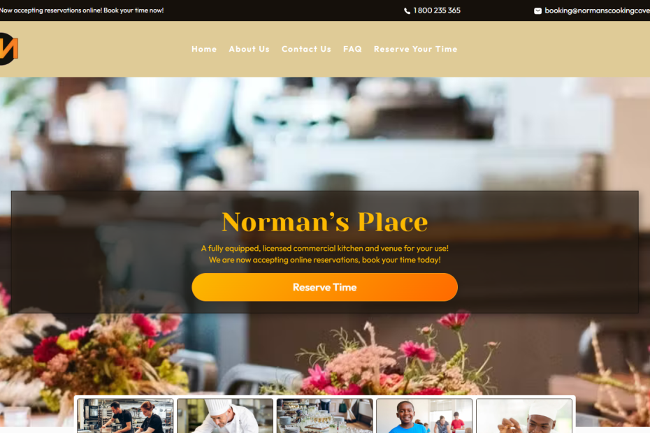
Norman’s Place needed a new logo! They had fallen in love with my own textmark logo and wanted something very similar. I created a customized textmark logo for them with colors that match their website colors and placed it on a simple black circle background for a striking contrast.
View their logo in use at https://www.normanscookingcove.com


